Blog Layout

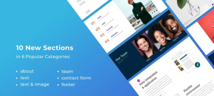
You've Got 10 Great-Looking New Sections!

Open the Sections panel of any site and you’ll find 10 new Sections for you to add to your sites, in the following categories:  About, Team, Text, Text and Image, Contact Form, Footer.
These sections, which feature new design layouts, are a super way to refresh your sites, or build entirely new ones from scratch. 
Scroll down to see all of the new Sections. At the bottom, you’ll find step-by-step instructions for recreating one of the Text & Image sections on your own.

About Section

Text Section


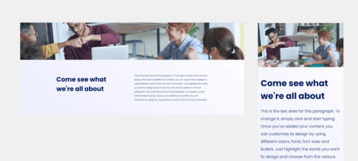
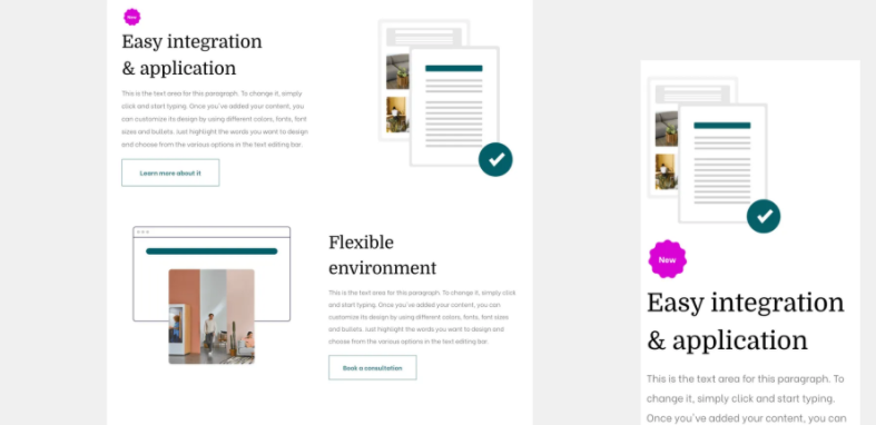
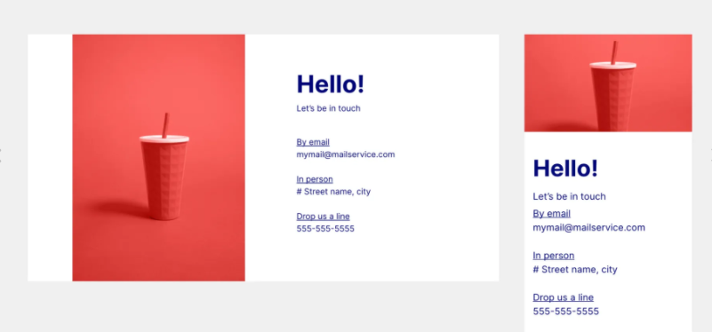
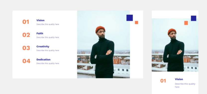
Text & Image Sections
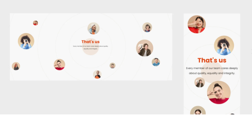


  • Slide title

    Write your caption here
    Button
  • Slide title

    Write your caption here
    Button

Team Sections


  • Slide title

    Write your caption here
    Button
  • Slide title

    Write your caption here
    Button

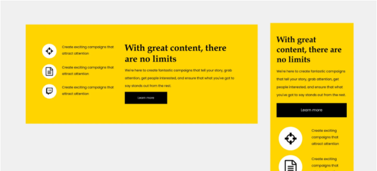
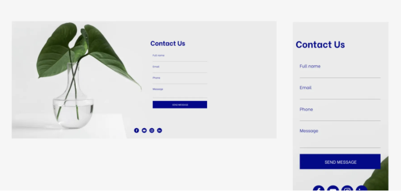
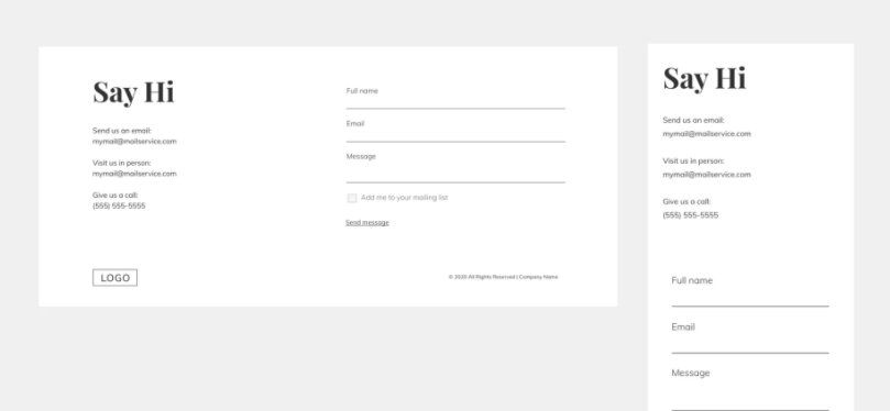
Contact Form Sections
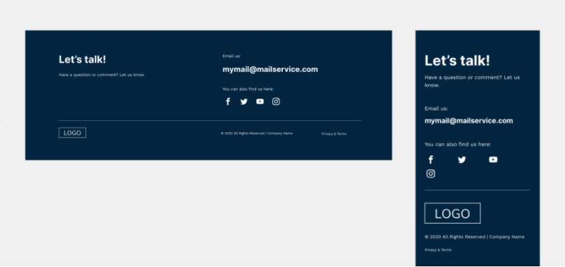

  • Slide title

    Write your caption here
    Button
  • Slide title

    Write your caption here
    Button

Footer Section


  • Slide title

    Write your caption here
    Button
  • Slide title

    Write your caption here
    Button

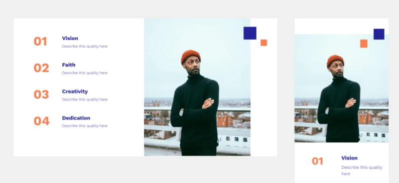
Recreate this Section on Your Own


To recreate this Text & Image section on your own, and make sure it looks great on mobile, follow the steps below. 

Add a row. Set the background color to white and the left padding to 40px.

Add 2 columns to the row, for a total of 3 columns.

In column 1, set the top and bottom padding to 70px, and the right padding to 20px.

  • Add an inner row with 2 columns
  • In column 1, add a title widget; in column 2, add a title and text widget.


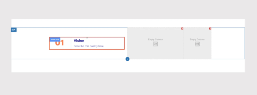
Copy and paste this inner row to create as many of them as you want. In this Section, we pasted it three times. 

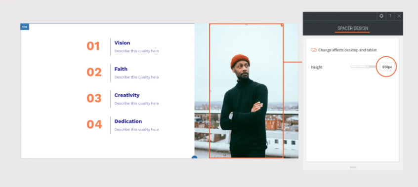
In column 2, add a background image and set the position to cover, center.

Set spacing to 0px.


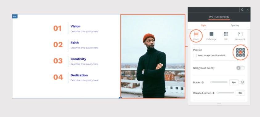
Add a spacer widget and set it to 650px.

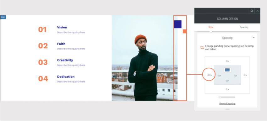
In column 3, add 2 shape widgets:

  • Shape widget 1: Set the height and width to 60px and the color to blue. Right-click on the shape and align left.
  • Shape widget 2: Set the height and width to 30px and the color to orange. Right-click on the shape and align right. 
  • Set the column spacing: Top padding 40px and left margin to -30px, so the blue shape overlaps the image.

Adjust the width of the columns to create the right ratio between them - in this case, the ratio is about 4:2:1. 


Adjusting for Mobile


To make sure this section looks great on mobile, go to the mobile view and make the following adjustments:

Open the Row Design Editor and toggle the Reverse column order to on, so the rightmost column, the one with the shapes, appears on the top.

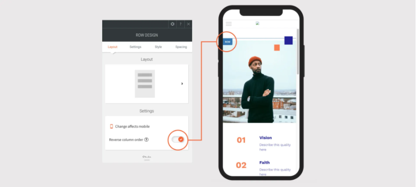
Set the left and right padding to this column to 30px and the bottom margin to -40px (so the shapes overlap the image).

Adjust the size of the shapes: 

Shape 1: Set the size to 40px and align it right. 

Shape 2: Set the size to 30px and the left margin to 250px

In column 2, set the background image to cover and the spacer height to 360px.

In column 3, open each inner row and choose the second layout, so the columns in the inner rows appear side by side.


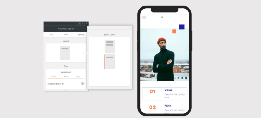
  • In column 1, align the title center.
  • In column 2, align the title and text left.


By Trung Nguyen February 6, 2025
Unlocking Business Potential with AI Automation: The Rise of AI Builders in Vietnam
By Trung Nguyen November 6, 2022
Nhân viên marketing
By Trung Nguyen November 6, 2022
Nhân viên bán hàng
By Trung Nguyen November 6, 2022
Admin (Trợ lý văn phòng)
By Trung Nguyen November 6, 2022
Trợ giảng
By Trung Nguyen November 6, 2022
Giảng viên dạy lập trình
By Support Tagsolution December 11, 2020
Đối với doanh nghiệp hay cá nhân, việc phân tích dữ liệu của website đóng vai trò cực kỳ quan trọng. Nó không chỉ giúp chúng ta nắm rõ tình hình phát triển của website mà còn hỗ trợ chúng ta đưa ra phương án tối ưu website một cách hiệu quả hơn. Ngoài ra, việc phân tích này giúp chúng ta hiểu được nhu cầu, sở thích của khách hàng. Từ đó, giúp doanh nghiệp hay cá nhân lựa chọn sản phẩm kinh doanh phù hợp hơn, thúc đẩy hiệu quả kinh doanh. Vậy, câu hỏi là công cụ nào đủ mạnh giúp chúng ta theo dõi, phân tích dữ liệu website và yêu cầu ở mức "thời gian thực". Google Analytics sẽ giúp chúng ta làm được điều đó.
By Support Tagsolution December 8, 2020
Mẫu website mới cho hội yêu sức khỏe
By Support Tagsolution December 1, 2020
Đôi khi bạn cần hiển thị nhiều hình ảnh cùng lúc tại một vị trí nào đó trong website (ví dụ: ảnh chụp các hướng của một ngôi nhà, ảnh các góc chụp của một chiếc váy, v.v.), bạn sẽ cần sử dụng đến "image slider - bộ trượt hình ảnh". Từ bây giờ, người dùng sử dụng tính năng bộ trượt hình ảnh trong nền tảng ITAGSWEB không những tùy biến được hiệu ứng di chuyển hình ảnh mà còn có thể điều chỉnh tốc độ di chuyển của ảnh. Tính năng mới này sẽ giúp bạn truyền tải thông tin hiệu quả hơn tới khách hàng khi họ ghé thăm website của bạn. Bạn có thể điều chỉnh tốc độ di chuyển ảnh nhanh hoặc chậm tùy thuộc vào nội dung bạn muốn truyền tải. Nhanh hơn khi chỉ có ảnh hiển thị, và cần chậm hơn khi khách hàng cần thời gian để đọc hết chữ trong từng ảnh. Hãy bắt đầu với thiết lập "image slider" trong ITAGSWEB thôi!
By Support Tagsolution November 30, 2020
Mọi người đang dành rất nhiều thời gian ở nhà trong những ngày gần đây, nên việc nâng cấp cho ngôi nhà của mình đang trở thành xu thế. Và để bắt đúng trend này, ITAGSWEB đã tạo 1 template website mới dành cho dịch vụ Xây và Cải tạo nhà (Renovation và Construction). Nó rất đơn giản nhưng hiện đại, và có thể sử dụng trong bất kì dịch vụ nào liên quan đến ngành xây dựng
More Posts
Share by: